アプリ関連ニュース
- 2021年12月03日
- 技術情報
JS(Chart.js)-内側と外側にdata labelsを表示する方法
今回は、Chart.js DataLabelsを使って、canvasに円グラフを描く方法をご紹介します。
まずは、htmlファイルを作成し、その中に4つのスクリプトファイルをインポートしています。
<script src="https://cdn.jsdelivr.net/npm/chart.js@3.0.0/dist/chart.min.js"></script>
<script src="https://cdn.jsdelivr.net/npm/chart.js@2.8.0"></script>
<script src="https://cdn.jsdelivr.net/npm/chartjs-plugin-datalabels@2.0.0"></script>
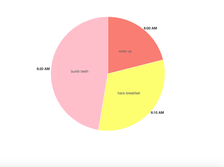
<script src="https://unpkg.com/chart.js-plugin-labels-dv@3.0.5/dist/chartjs-plugin-labels.min.js"></script><canvas id="my-chart"></canvas>以上のcanvasにに円グラフを作成します。円グラフを作成するには、このようなdataが含まれている必要があります。
        var data = {
                labels: ["6:00 AM", "6:15 AM", "6:20 AM"],

                datasets: [
                    {
                        labels: ["wake up", "have breakfast", "bursh teeth"],
                        backgroundColor: ["#FA8072","#FFFF66","#FFC0CB"],
                        data: [40, 60, 90],
                        borderWidth: 1,

                    }
                ]
};また、typeをpieにする必要もあります。もう一つ、datalabelsを表示するために、グラフにプラグイン名をインポートします。
var myChart = new Chart(ctx, {
            type: 'pie',
            data: data,
           plugins: [ChartDataLabels],
});
ラベルを外に見せるために、このようなセットを挿入します。
                    labels: {
                        render: function(d) {
                            return `${d.label}`;
                        },
                        position: 'outside',
                    },
円グラフの中で、ラベルを表示するには次のようにします。
datalabels: {

                        formatter: function(value, context) {
                            return context.dataset.labels[context.dataIndex];
                        },
                  },
その結果が上部に表示されています。
この記事を楽しんでもらえたら嬉しいです。
By Ami
asahi at 2021年12月03日 10:00:00
- 2021年12月02日
- Web Service
The 10 best new features in Laravel 8
1. app/Models Directory
The artisan:make model command will create the model in the app/Models directory. This feature was decided after Taylor asked people on Twitter how they feel about this.
If you don’t like that, it’s possible to delete the app/Models directory and artisan will create the model file in the app/ folder.
2. New Landing Page
Laravel 8 comes with a new landing page for a brand new install. It is now redesigned and It is built using TailwindCSS, includes light and dark-mode capabilities, and by default extends links to SaaS products and community sites.
3. Controllers Routing Namespacing
No more double prefix issues! In previous versions of Laravel, the RouteServiceProvider had an attribute called namespace that was used to prefix the controllers in the routes files. That created a problem when you were trying to use a callable syntax on your controllers, causing Laravel to mistakenly double prefix it for you. This attribute was removed and now you can import and use it without the issue.
It can also be used for single action controllers that have the __invoke method.
Route::get(‘/welcome’, [WelcomeController::class, ‘index’]);
Route::get(‘/welcome’, WelcomeController::class);
4. Route Caching
Laravel uses route caching to compile your routes in a PHP array that is more efficient to deal with. In Laravel 8, it’s possible to use this feature even if you have closures as actions to your routes. This should extend the usage of route caching for improved performance.
Route::get(‘/components’, function(){
return view(‘button’);
});
5. Attributes on Extended Blade Components
In Laravel 7 the child components didn’t have access to the $attributes passed to it. In Laravel 8 these components were enhanced and it is now possible to merge nested component attributes. This makes it easier to create extended components.
6. Better Syntax for Event Listening
In the previous versions of Laravel, when creating a closure-based event listener there was much repetition and a cumbersome syntax.
Event::listen(ConferenceScheduled::class, function( ConferenceScheduled $event){
info(get_class($event));
});
In Laravel 8 it’s simpler and cleaner:
Event::listen(function( ConferenceScheduled $event){
info(get_class($event));
});
//one line version
Event::listen(fn( ConferenceScheduled $event =>info(get_class($event))));
7. Queueable Anonymous Event Listeners
In Laravel 8 it is possible to create queueable closure from anywhere in the code. This will create a queue of anonymous event listeners that will get executed in the background. This feature makes it easier to do this, while in previous versions of Laravel you would need to use an event class and an event listener (using the ShouldQueue trait).
<?php
namespace App\Models;
use function Illuminate\Events\queueable;
Class User extends Authenticable
{
protected static function booting()
{
static::created( queueable ( function (User $user) {
info(‘ Queued: ‘.$user->name);
});
}
}
8. Maintenance Mode
artisan down —secret=laracon-2020
This is especially useful when you need to do some maintenance on your application and you want to take it down for your users but still let your developers investigate bugs. This will create a secret cookie that will be granted to whoever hits the correct endpoint, allowing it to use the application while in maintenance mode.
artisan down –render=”errors:503″
Pre-rendering an error view is a safe way for not exposing errors to your end user when your application is down (during a new deployment, for example). The Laravel 8 framework guarantees that your predefined error page will be displayed before everything else from the application.
artisan down –render=”welcome” –redirect=/ –status=200 –secret=laracon-2020
This combines the new features and will make the application only display a single predefined route, while still allowing for the people who have the secret to test and debug. This can be very useful when launching a new app.
9. Closure Dispatch “Catch”
Route::get(‘/queue-catch’, function(){
dispatch( function() {
throw new Exception(‘Something went wrong…’);
})->catch(function( Throwable $e){
info(‘Caught exception!!’);
})
});
Laravel has a pretty robust queue system that accepts a closure queue that will get serialized and executed in the background. Now we have a way to handle failures in case your job fails.
10. Exponential Backoff Strategy
This is an algorithm that decreases the rate of your job in order to gradually find an acceptable rate.
public function backoff(){
return [1,5,10];
}
Tsuki
tsuki at 2021年12月02日 07:02:50
- 2021年12月02日
- 技術情報
Laravel フォーム入力内容の復元
入力フォームを設置する場合に編集モードでは、DBに登録されている値を初期値として表示、
またバリデーションエラーになった場合はフォームに入力した値を復元したい場合があります。
そのような場合は、Laravelではold関数を使用することで簡単に対応できますので
その方法をシェアしたいと思います。
old関数について
{{ old(‘name’) }}
old関数の第2引数にデフォルト値が設定できます。DBに登録されている値を
初期値として表示したい場合に便利です。
{{ old(‘name’, ‘デフォルト値’) }}
テキストボックスの使用例
最もシンプルなテキストボックスでの使用例です。
<input type="text" name="name" id="name" value="{{ old('name', $recdata['name']) }}">
ラジオボタンの使用例
ラジオボタンは複数の選択肢の中からひとつだけ選択できる入力フォーマットです。
選択しているボタンの属性に「checked」をつけ加えるためold関数の値から条件分岐を設定しています。
@foreach ($list as $item)
<span><input type="radio" name="gender" id="gender{{$item->code}}" value="{{$item->code}}"
{{ old('gender', $recdata['gender'])==$item->code ? 'checked':'' }}>
<label for="gender{{$item->code}}" class="radio">{{$item->value}}</label></span>
@endforeach
プルダウンメニューの使用例
プルダウンメニューは複数の選択肢の中からひとつだけ選択できる入力フォーマットです。
選択しているリストアイテムの属性に「selected」をつけ加えるためold関数の値から条件分岐を設定しています。
<select name="pref" id="pref">
<option value="">都道府県を選択</option>
@foreach ($prefs as $pref)
  <option value="{{$pref->code}}"
  {{ old('pref', $recdata['pref'])==$pref->code ? 'selected':'' }}>
  {{$pref->value}}</option>
@endforeach
</select>
チェックボックスの使用例
チェックボックスは複数の選択肢の中から複数選択可能な入力フォーマットです。
複数選択可能なため配列になっています。
選択しているチェックボックスの属性に「checked」をつけ加えるためold関数の値から条件分岐を設定しています。
@foreach ($list as $item)
<span><input type="checkbox" name="fav_player[]" id="fav_player{{$item->code}}" value="{{$item->code}}"
@if (is_array(old("fav_player", $recdata['fav_player'])) && in_array($item->code, old('fav_player', $recdata['fav_player']))) checked @endif>
<label for="fav_player{{$item->code}}" class="checkbox">{{$item->value}}</label></span>
@endforeach
木曜日担当:nishida
nishida at 2021年12月02日 10:00:00
- 2021年12月01日
- Apple
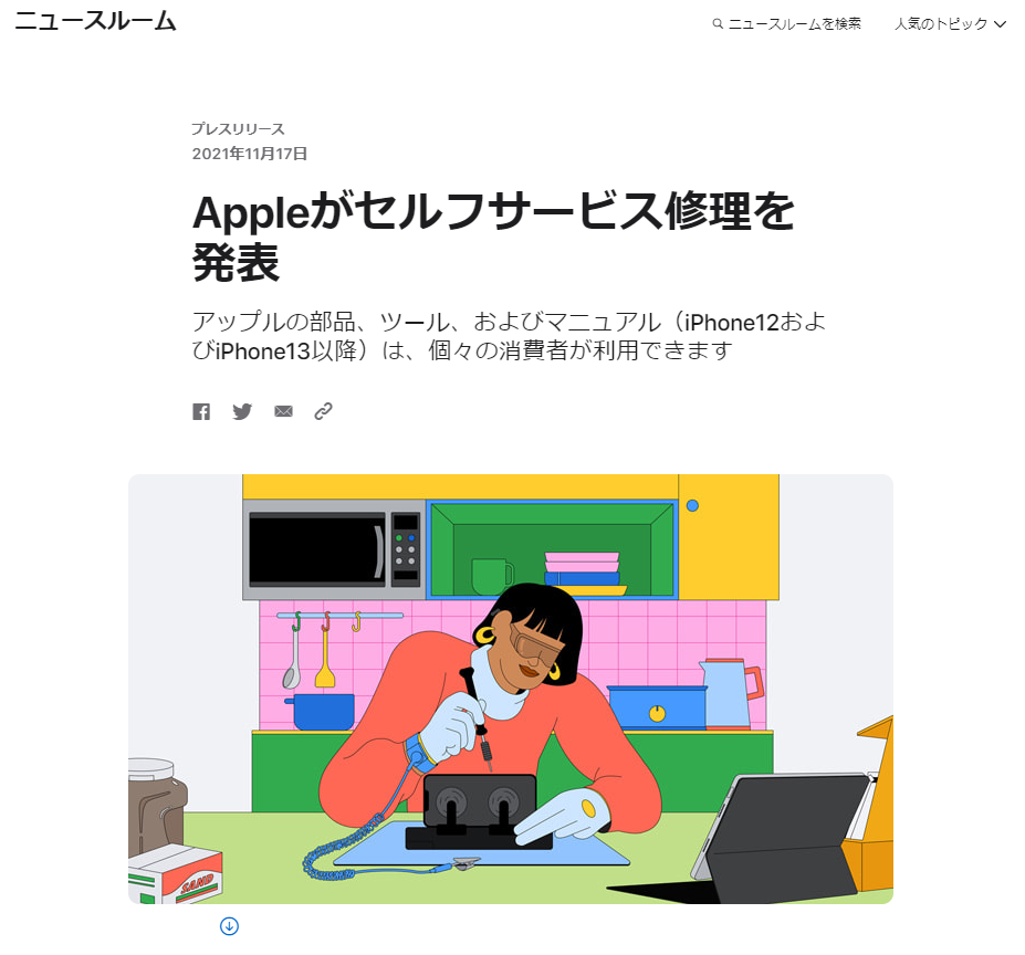
iPhoneやMacの修理が個人でも可能になるかもしれません
Appleは ユーザーに対して iPhone12以降の iPhone の修理用部品の販売や修理マニュアルを提供を始めると発表しました。
M1チップを搭載したMacにも対象を広げることも予定しているようです。
2022年の初め頃にアメリカでこの修理プログラムの利用が開始され、
その後に他の国へ対象が広げられるようです。
初めにディスプレイやカメラ、バッテリーの修理用部品の提供が開始され、後半にその他の機能の修理用部品の提供が行われるようです。
日本国内でこの修理プログラムが提供されるかどうかは現時点では分かりませんが、
提供されれば非正規の修理店や個人で修理が容易になり必要な修理費用をおさえる事が可能になるかもしれませんね。
修理後の端末が技適に適合するのか等、総務省の判断も気になるところです。
水曜担当:Tanaka
tanaka at 2021年12月01日 10:00:00
- 2021年11月30日
- 未分類
Code Obfuscation
Obfuscation is making something complex and difficult to understand. Programming codes are often obfuscated to decrease the security risks such as preventing an attacker from reverse engineering a software program and protect intellectual properties.
Code obfuscation is not about changing the program’s original code contents, but rather about making the presentation of that code more confusing. Obfuscation does not change how the program works or outputs.
The following are some techniques we should know about obfuscation.
Renaming
The obfuscator alters the methods and names of variables. The new names may include unprintable or invisible characters.
Packing
This compresses the entire program to make the code unreadable.
String encryption
This method uses encryption to hide the strings in the executable and only restores the values when they are needed to run the program. This makes it difficult to go through a program and search for particular strings.
Control flow
The decompiled code is made to look like spaghetti logic, which is unstructured and hard to maintain code where the line of thought is obscured. Results from this code are not clear, and it’s hard to tell what the point of the code is by looking at it.
Instruction pattern transformation
This approach takes common instructions created by the compiler and swaps them for more complex, less common instructions that effectively do the same thing.
Dummy code insertion
Dummy code can be added to a program to make it harder to read and reverse engineer, but it does not affect the program’s logic or outcome.
Metadata or unused code removal
Unused code and metadata give the reader extra information about the program, much like annotations on a Word document, that can help them read and debug it. Removing metadata and unused code leaves the reader with less information about the program and its code.
Summary
Obfuscation techniques are used in various cases. For example, these can be used to stop someone from copying your client-side code. And enterprises also need to make sure that websites are protected against malicious code injection and it difficult to discover useful information such as trade secrets (IP), credentials, or security vulnerabilities from an application.
Hope you enjoy that.
By Asahi
waithaw at 2021年11月30日 10:00:00
 大人が楽しめるヒーリング絵本河童のカパと静かな森
 パワースポット 日本三大神滝布引の滝
 佐藤・広幸ドイツ魂
 Himeji Castle姫路城
 ボイドタイムお知らせアプリVoid Time 〜月を無視できない〜
 撮った写真をカレンダーに撮りカレ
 ライブ壁紙竹田城ライブ壁紙
 赤ちゃんにっこりBaby+Smile
 電子書籍[for iPhone]ターラのアストロロジー
 Android 17の新機能「バブル」でマルチタスクがさらに快適に
 スマートウォッチは「記録」から「提案」の時代へ?