Let’s learn flutter UI with me
- 2021年10月22日
- 技術情報
For this week, I will create only user interface design for android app using flutter. In this article I will explain deeply the usage of widget and we can learn a lot of flutter widget and how to clearly create folder structures etc.
Firstly I create images asset folders from the app directory named with assets. Like this :
project_name/assets/images/your_image.jpgAfter inserting images in assets folder, we will need to apply this image to our app. So we have to put images assets in pubspec.yaml file.
Let’s starting coding in main.dart file. In our widget, we call Profile page named with profile_page.dart. You can also use other file name.
Widget build(BuildContext context) {
return MaterialApp(
title: 'Flutter Demo',
debugShowCheckedModeBanner: false,
theme: ThemeData(
primarySwatch: Colors.blue,
),
home: ProfilePage()
);
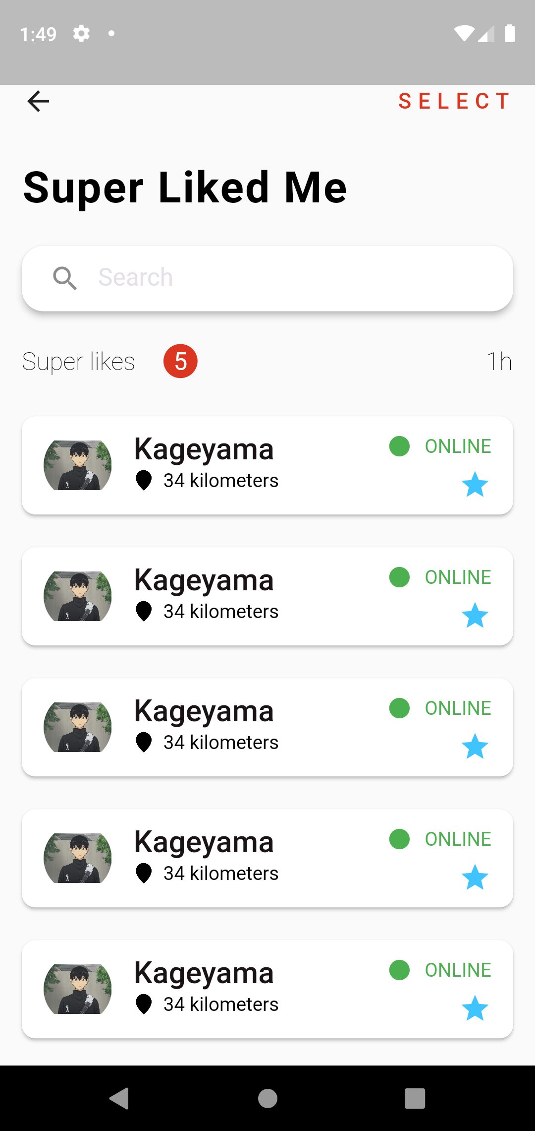
}In our ProfilePage for appbar, inside the scaffold widget I create Row widget with leading and trailing, leading is that will display back button and trailing is that will display SELECT text in right side of the screen of the one row.
        child: Row(
          children: <Widget>[
            leading : GestureDetector(
          onTap: () {
            Navigator.of(context).pop();
          },
          child: Icon(Icons.arrow_back),
        ),
            Spacer(),
            trailing : Text(
          "SELECT",
          style: actionMenuStyle,
        ),
          ],
        ),
And for display Super Liked Me text and other design, I create one Column widget inside the body. For display Super Liked Me text, We can use Text Widget inside a Padding widget.
         Padding(
            padding: const EdgeInsets.all(16),
            child: Text(
              "Super Liked Me",
              style: headingTextStyle.copyWith(color: Colors.black),
            ),
          )
The next design for beautiful Search box, we can use TextField widget inside a Card Widget. If you do rounded search bar, we can use inside RoundedRectangleBorder widget with properties BorerRadius.circular(30) widget.
          Card(
            elevation: 4,
            shape: RoundedRectangleBorder(
              borderRadius: BorderRadius.circular(16),
            ),
            margin: const EdgeInsets.symmetric(horizontal: 16, vertical: 8),
            child: Padding(
              padding: const EdgeInsets.symmetric(horizontal: 8),
              child: TextField(
                decoration: InputDecoration(
                    border: InputBorder.none,
                    prefixIcon: Icon(Icons.search),
                    hintText: "Search",
                    hintStyle: whiteSubHeadingTextStyle.copyWith(color: hintTextColor)),
              ),
            ),
          )
And another design from the left side of Super Likes Text , the center of 5 text and the last text of 1h, to display this we can use Row widget again. Inside the Row widget , we can use three Text Widgets. Like this:
 Row(
   children: <Widget>[
     Text("Super likes",...),
        Text("5",..),
        Spacer(),
         Text("1h",..),
     ],
    )
The last thing to display a list design , we can use ListView.builder widget. If you want to scrolling the listview, we can use Expanded , that will wrap ListView.builder widget. For display the item look like a card, we can use Card Widget inside ListView.builder widget.Inside a Card widget to display subtitle, we can use ListTitle widget with subtitle property. Inside the card the first thing wanted to display item is used leading property and for the last item trailing property. And we need to add itemCount: 10 property for how many list item will display. This example is item count for 10 times.
 Expanded(
   child: ListView.builder(
      itemBuilder: (context, index) {
         return Card(
           child: ListTile(
             title: Text(.....),
               subtitle: Row(...),
               leading: ClipOval(...),
               trailing: SizedBox(...),
                ),
               );
             },
      itemCount: 10,
            ),
          ),
Hope you enjoyed this article.
By Ami
asahi at 2021年10月22日 10:00:00
 大人が楽しめるヒーリング絵本河童のカパと静かな森
 パワースポット 日本三大神滝布引の滝
 佐藤・広幸ドイツ魂
 Himeji Castle姫路城
 ボイドタイムお知らせアプリVoid Time 〜月を無視できない〜
 撮った写真をカレンダーに撮りカレ
 ライブ壁紙竹田城ライブ壁紙
 赤ちゃんにっこりBaby+Smile
 電子書籍[for iPhone]ターラのアストロロジー
 Android 17の新機能「バブル」でマルチタスクがさらに快適に
 スマートウォッチは「記録」から「提案」の時代へ?