アプリ関連ニュース
- 2021年10月28日
- Web Service
Clear Cache – Useful Chrome Extension
When we develope websites or mobile apps, one of the important facts we need to think is performance. For example, if the website is using too many images, we need to use cloud storage like S3. Sometimes we need to use cache for better performance.
But when we need to update our code and test again, we have to clear the browser cache to see the changes. Browser cache is cleared by the browser setting. I think it is a little busy for developers. So today I want to share useful chrome extension to clear browser cache.
Clear Cache is a useful chrome extension. Install the extension and select the small recycle icon in your browser to clear the browser cache. There are no confirmations and no extra dialogs to contend with. For easy usage, you can pin in your Chrome browser.
by tsuki
tsuki at 2021年10月28日 10:00:00
- 2021年10月27日
- Mac
macOS Montereyがリリースされました
10月26日からmacOS Montereyの配信が開始されました。
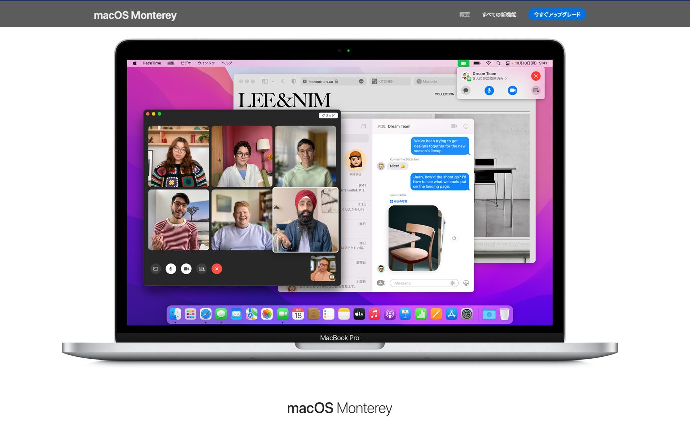
FacetimeにWindowsから参加できるようになったり、
写真内のテキストを抽出したり、さらにそのテキストを翻訳できるようになったようです。
私が気になっているのは
Object Capture
というものでコレは複数枚の連続した画像から3Dオブジェクトをつくれるという機能のようです。
追加された機能のうちいくつかはApple Siliconを搭載したmacでのみ利用でき、
Intel CPUを搭載したMacでは利用できないようです。
macとiPadの間をシームレスに操作できるユニバーサルコントロール機能は、
リリース時には含まれず、秋ごろのアップデートで追加されるそうです。
水曜担当:Tanaka
tanaka at 2021年10月27日 10:00:00
Laravel Package to translate with a translation API
Today I would like to share about a laravel package that I wrote recently. That package is to translate languages easily using a translation API. I had to use a translation api in my project. Then I wanted to write short code for translation feature and reuse it for future. So I created this package locally.
Methods that can be used
After creating Translation Object, you can use the following methods.
$obj = new Translate();Translation
$translated_text = $obj->translate('Hello World", 'EN', 'JA');

echo $translated_text;
Getting supported languages
$languages = $obj->languages();

foreach($languages as $lang){
    echo $lang['language']."-".$lang['name'].'<br>';
}
Getting supported source–languages
$source_languages = $obj->languages('source');

foreach($source_languages as $lang){
    echo $lang['language']."-".$lang['name'].'<br>';
}
Getting supported target–languages
$target_languages = $obj->languages('target');

foreach($target_languages as $lang){
    echo $lang['language']."-".$lang['name'].'<br>';
}
You can monitor your usage of translation API
$usage= $obj->usage();

echo $usage['character_count'].' characters have been used. Maximum number of characters that can be translated in the current billing period are '.$usage['character_limit'];
You can setup a timeout in requesting api
$obj->setTimeout(10);
Hope you enjoyed that.
By Asahi
waithaw at 2021年10月26日 10:00:00
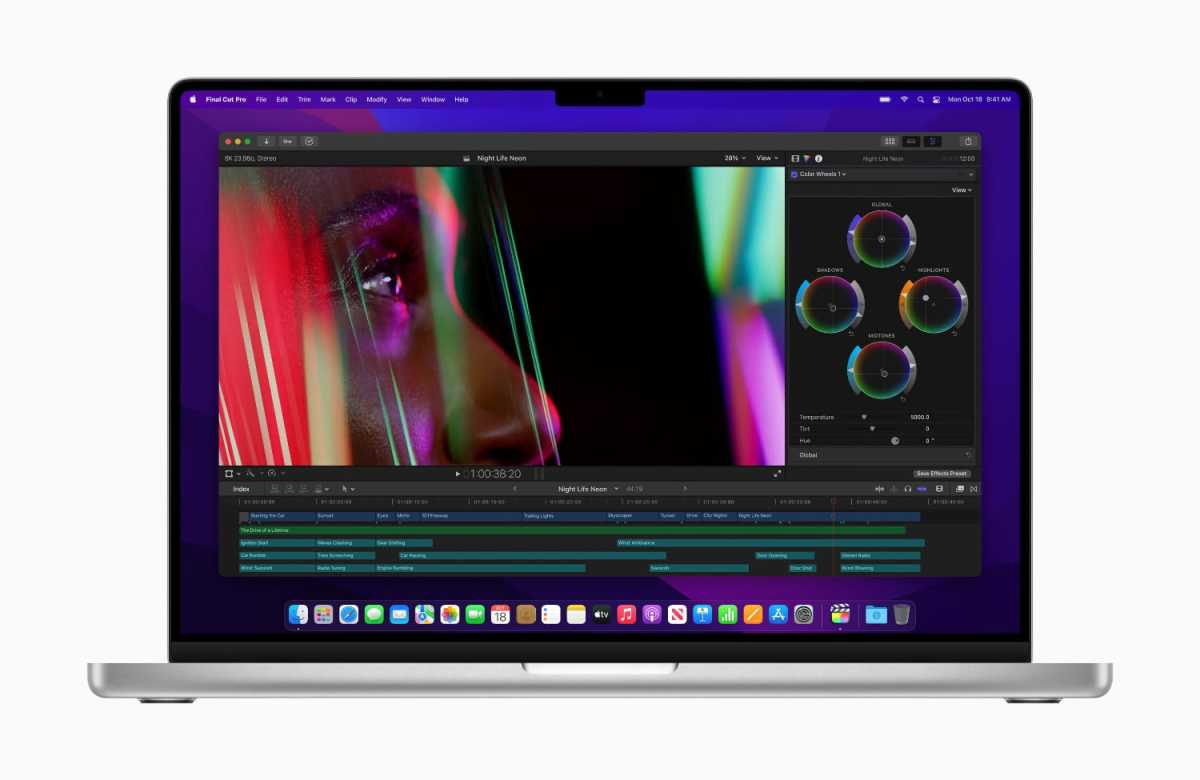
New M1 Pro & M1 Max
Apple launched the new 14-inch and 16-inch MacBook Pro laptops at its recent October event. The new laptop features a new redesign with smaller bezels, a new screen, new ports, new Apple silicone, and more.
Performance (Processor, RAM, graphics)
The M1 Pro and M1 Max are the newest Apple System on a Chip (SoC), following the M1 that was released last year. I am not mentioning all the detail specs here as you can easily see at apple official website. Both of 14 and 16inches are in beast mode as they improve at all aspects, also more expensive.
Screen Display
The 14-inch and 16-inch MacBook Pros are the first Apple laptops to use a mini LED screen, which Apple calls the Liquid Retina XDR. The mini LED used in the 12.9-inch iPad Pro is a backlight technology with more LEDs than currently implemented. This gives you better backlight control, better image contrast, and greater dynamic range. These laptop displays are also the first displays to support a 120Hz refresh rate using ProMotion technology, previously found only on Apple’s iPhone and iPad Pro.
Design & Color
The new 14-inch and 16-inch MacBook Pro features a new aluminum case design that makes your notebook smaller than its predecessor. The bezel (the border around the screen) has been significantly reduced so that the MacBook Pro logo appears at the bottom of the laptop instead of at the bottom of the screen. At the top of the screen, like the iPhone, there’s a notch for the FaceTime camera. Apple creates the notch as deep as the menu bar so it doesn’t break into your workspace. The MacBook Pro is available in two colors, silver and space gray.
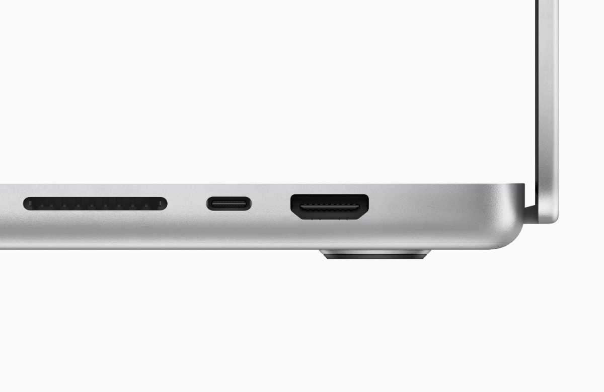
Ports
I am so glad the real ports are back, no extra dongles. The MacBook Pro comes with three Thunderbolt / USB 4 ports. Apple also includes an SDXC card slot, an HDMI 2.0 port, and a headphone jack that supports high-impedance headphones.
Power adapter & battery
The power adapter connects to the new MagSafe connector on your laptop. This is similar to the old MagSafe adapter for MacBooks pre-USB-C. However, the wattage of the adapter depends on the model you purchase. It can be said that the battery life has been dramatically improved. See more details on Apple’s official website.
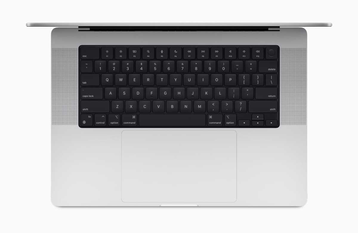
No more touchbar
Apple introduced a touch bar in 2016 to replace function keys with a “brilliant Retina-quality multi-touch display,” but to say the least, it was a divisive feature. Apple seems to have been persuaded by users who don’t like the touchbar, as the touchbar has been added to the new M1 Pro MacBook Pro and replaced with function keys. These function keys are full size, not half height keys. Like previous MacBook Pro models, it has a Touch ID button in the upper right corner of the keyboard, but with a circular ring like the iMac keyboard. I personally like the solid function keys.
As a conclusion, the new macbook pros are really awesome, both in physical and performance. Apple listens the customers’ feedbacks and add back function keys, ports and other improvements as well. I expected the FaceID login as they are including big notch but not this time, may be next release I guess.
By Yuuma
yuuma at 2021年10月25日 10:10:00
- 2021年10月22日
- 技術情報
Let’s learn flutter UI with me
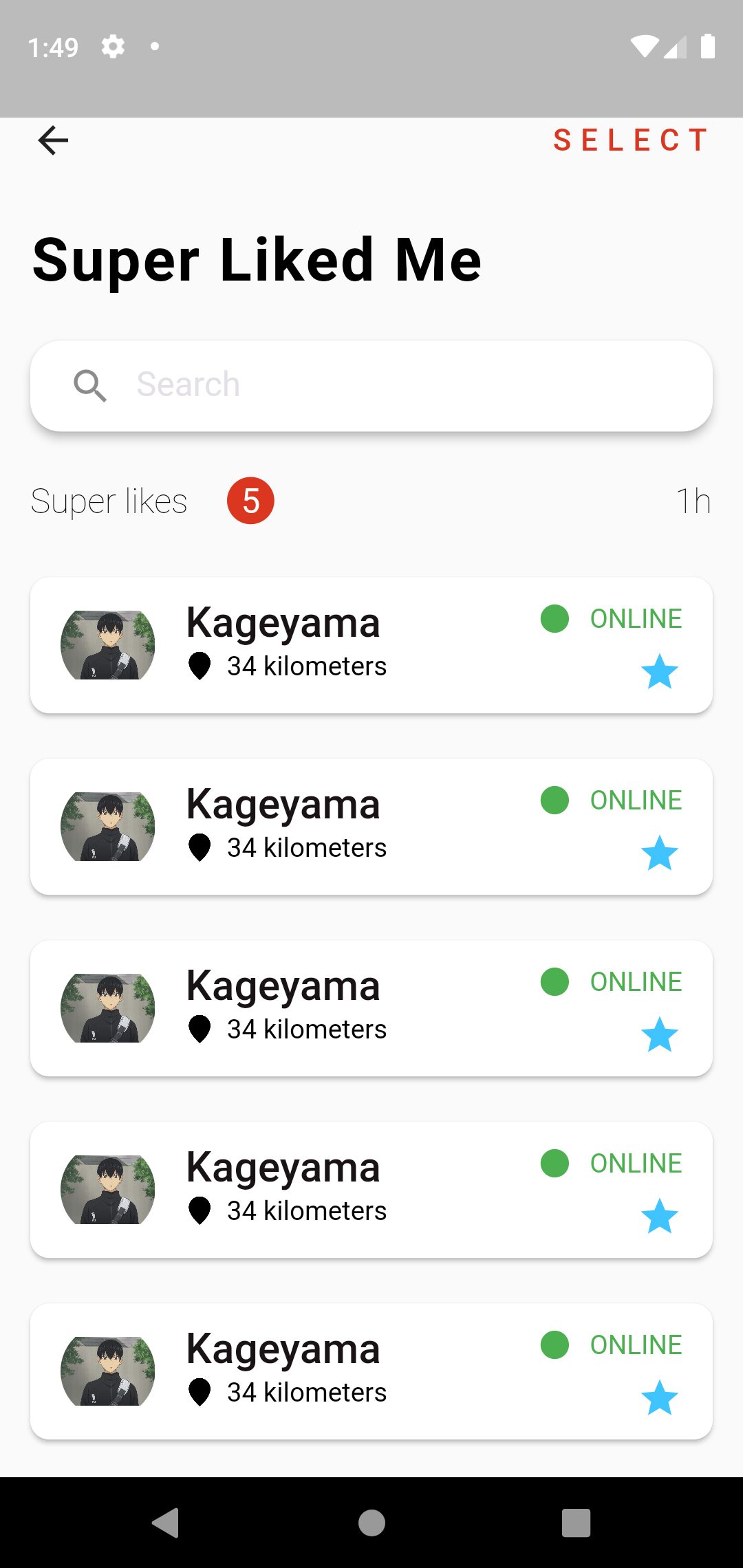
For this week, I will create only user interface design for android app using flutter. In this article I will explain deeply the usage of widget and we can learn a lot of flutter widget and how to clearly create folder structures etc.
Firstly I create images asset folders from the app directory named with assets. Like this :
project_name/assets/images/your_image.jpgAfter inserting images in assets folder, we will need to apply this image to our app. So we have to put images assets in pubspec.yaml file.
Let’s starting coding in main.dart file. In our widget, we call Profile page named with profile_page.dart. You can also use other file name.
  Widget build(BuildContext context) {
    return MaterialApp(
        title: 'Flutter Demo',
        debugShowCheckedModeBanner: false,
        theme: ThemeData(
            primarySwatch: Colors.blue,

        ),
        home: ProfilePage()
    );
  }
In our ProfilePage for appbar, inside the scaffold widget I create Row widget with leading and trailing, leading is that will display back button and trailing is that will display SELECT text in right side of the screen of the one row.
        child: Row(
          children: <Widget>[
            leading : GestureDetector(
          onTap: () {
            Navigator.of(context).pop();
          },
          child: Icon(Icons.arrow_back),
        ),
            Spacer(),
            trailing : Text(
          "SELECT",
          style: actionMenuStyle,
        ),
          ],
        ),
And for display Super Liked Me text and other design, I create one Column widget inside the body. For display Super Liked Me text, We can use Text Widget inside a Padding widget.
         Padding(
            padding: const EdgeInsets.all(16),
            child: Text(
              "Super Liked Me",
              style: headingTextStyle.copyWith(color: Colors.black),
            ),
          )
The next design for beautiful Search box, we can use TextField widget inside a Card Widget. If you do rounded search bar, we can use inside RoundedRectangleBorder widget with properties BorerRadius.circular(30) widget.
          Card(
            elevation: 4,
            shape: RoundedRectangleBorder(
              borderRadius: BorderRadius.circular(16),
            ),
            margin: const EdgeInsets.symmetric(horizontal: 16, vertical: 8),
            child: Padding(
              padding: const EdgeInsets.symmetric(horizontal: 8),
              child: TextField(
                decoration: InputDecoration(
                    border: InputBorder.none,
                    prefixIcon: Icon(Icons.search),
                    hintText: "Search",
                    hintStyle: whiteSubHeadingTextStyle.copyWith(color: hintTextColor)),
              ),
            ),
          )
And another design from the left side of Super Likes Text , the center of 5 text and the last text of 1h, to display this we can use Row widget again. Inside the Row widget , we can use three Text Widgets. Like this:
 Row(
   children: <Widget>[
     Text("Super likes",...),
        Text("5",..),
        Spacer(),
         Text("1h",..),
     ],
    )
The last thing to display a list design , we can use ListView.builder widget. If you want to scrolling the listview, we can use Expanded , that will wrap ListView.builder widget. For display the item look like a card, we can use Card Widget inside ListView.builder widget.Inside a Card widget to display subtitle, we can use ListTitle widget with subtitle property. Inside the card the first thing wanted to display item is used leading property and for the last item trailing property. And we need to add itemCount: 10 property for how many list item will display. This example is item count for 10 times.
 Expanded(
   child: ListView.builder(
      itemBuilder: (context, index) {
         return Card(
           child: ListTile(
             title: Text(.....),
               subtitle: Row(...),
               leading: ClipOval(...),
               trailing: SizedBox(...),
                ),
               );
             },
      itemCount: 10,
            ),
          ),
Hope you enjoyed this article.
By Ami
asahi at 2021年10月22日 10:00:00
 大人が楽しめるヒーリング絵本河童のカパと静かな森
 パワースポット 日本三大神滝布引の滝
 佐藤・広幸ドイツ魂
 Himeji Castle姫路城
 ボイドタイムお知らせアプリVoid Time 〜月を無視できない〜
 撮った写真をカレンダーに撮りカレ
 ライブ壁紙竹田城ライブ壁紙
 赤ちゃんにっこりBaby+Smile
 電子書籍[for iPhone]ターラのアストロロジー
 Android 17の新機能「バブル」でマルチタスクがさらに快適に
 スマートウォッチは「記録」から「提案」の時代へ?